Loblaw is Canada's largest retail chain and President's Choice is their largest brand. A go-to brand for everyday essentials and necessities, but also a one-stop shop(brand) for most customers. Their new addition to the PC Financial family is "PC Money"; a new division for prepaid credit card users, point collectors, and everyday banking solutions. This launch was another foot rooted in the ground to ensure all aspects of customers needs were met and more of a reason to be a one-stop for most.
The overall UI toolkit was taken after the "one-stop shop" idea for consumers, but implemented for creative users. We wanted to create something that any designer could pick up and just create on a whim without much instructions. Thinking of the customer on the other end, it was important to have a consistent, balanced, and user-friendly experience when interacting with any digital platforms. By creating this step-by-step toolkit it allows designers and agencies to think and create at a progressive pace, but to also remain consistent no matter the user or platform; almost as if the guidance was right next to them. (This toolkit was built in Sketch).
Company: BIMM | SidLee
Client: Loblaw | President Choice
Creative Direction: George Querubin
Production: George Querubin
Project Type: UI Design
Client: Loblaw | President Choice
Creative Direction: George Querubin
Production: George Querubin
Project Type: UI Design
(Left) Below is a brief walkthrough of the 'Symbols page' user-interaction. (Right) The 'Symbols page' is referenced as a legend when using the same content and assets for building. The beauty of an organized symbols page is you can update one asset in the legend and automatically apply it throughout all designs containing the same one within the file.
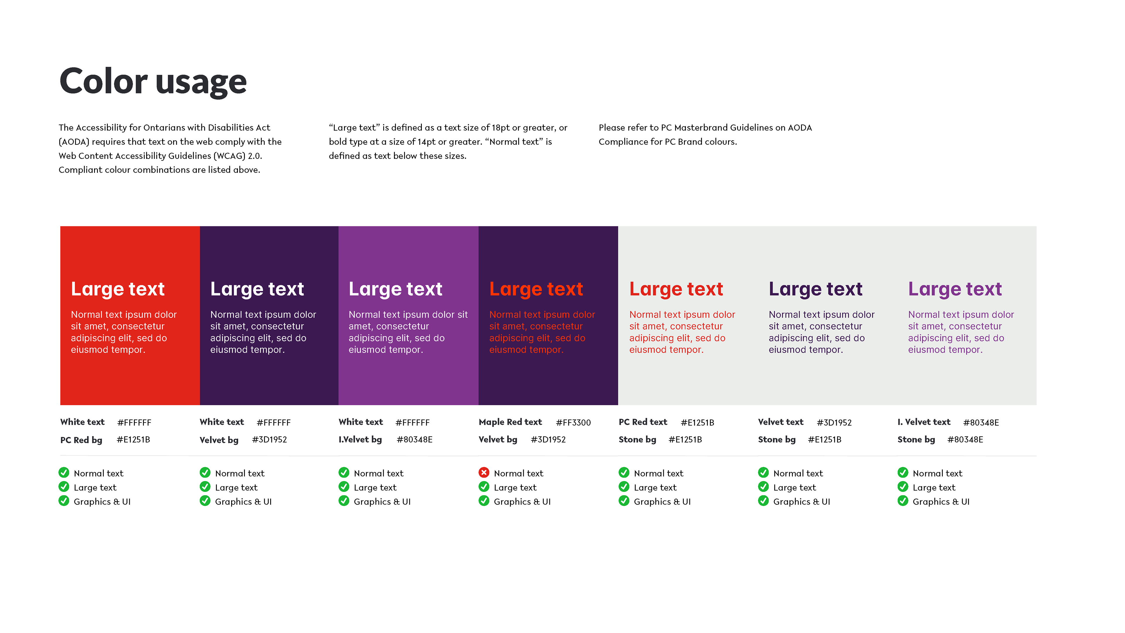
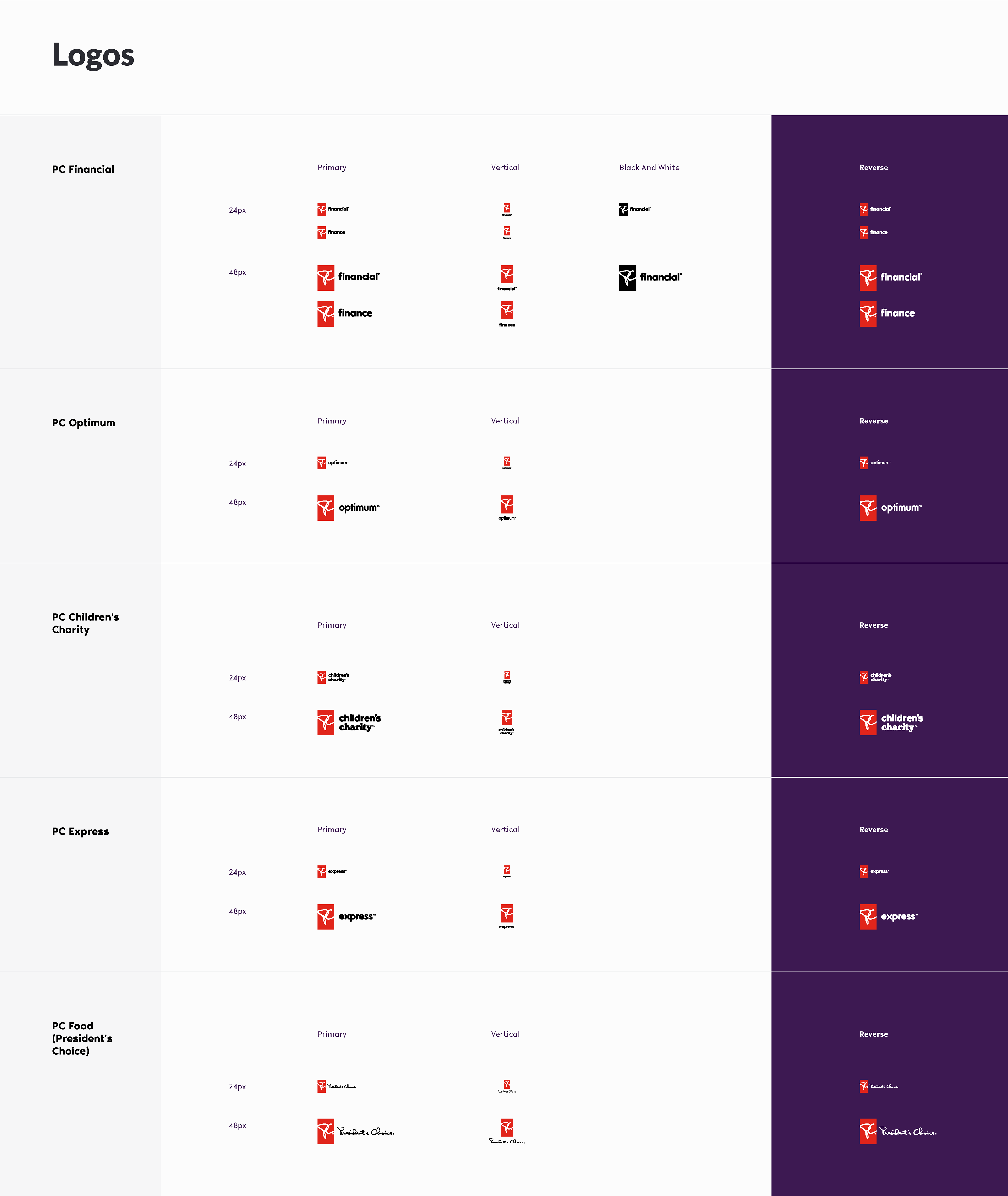
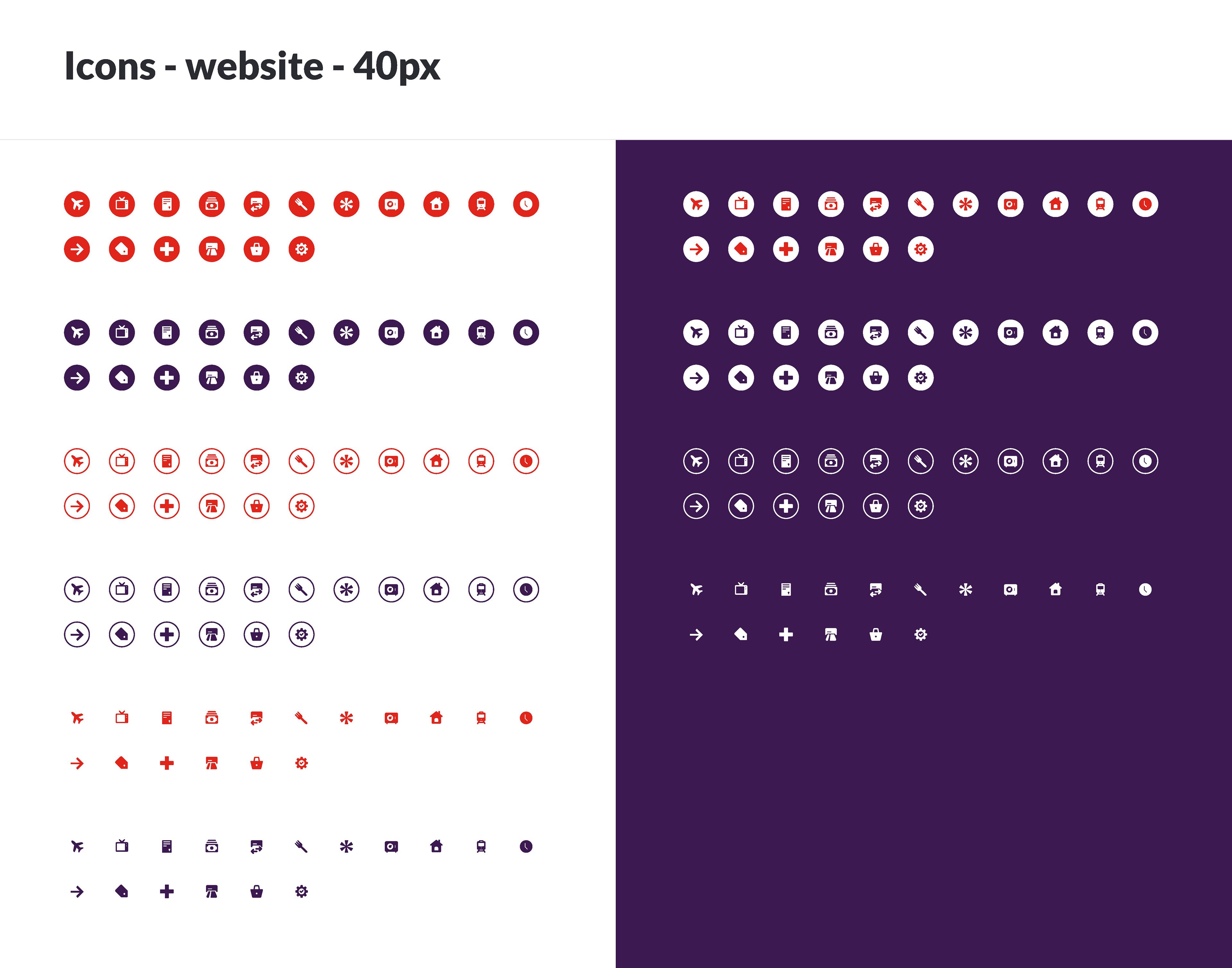
Highlighted below are some key content when building and using the UI kit.
(for a more detailed version, click here to request)
(for a more detailed version, click here to request)


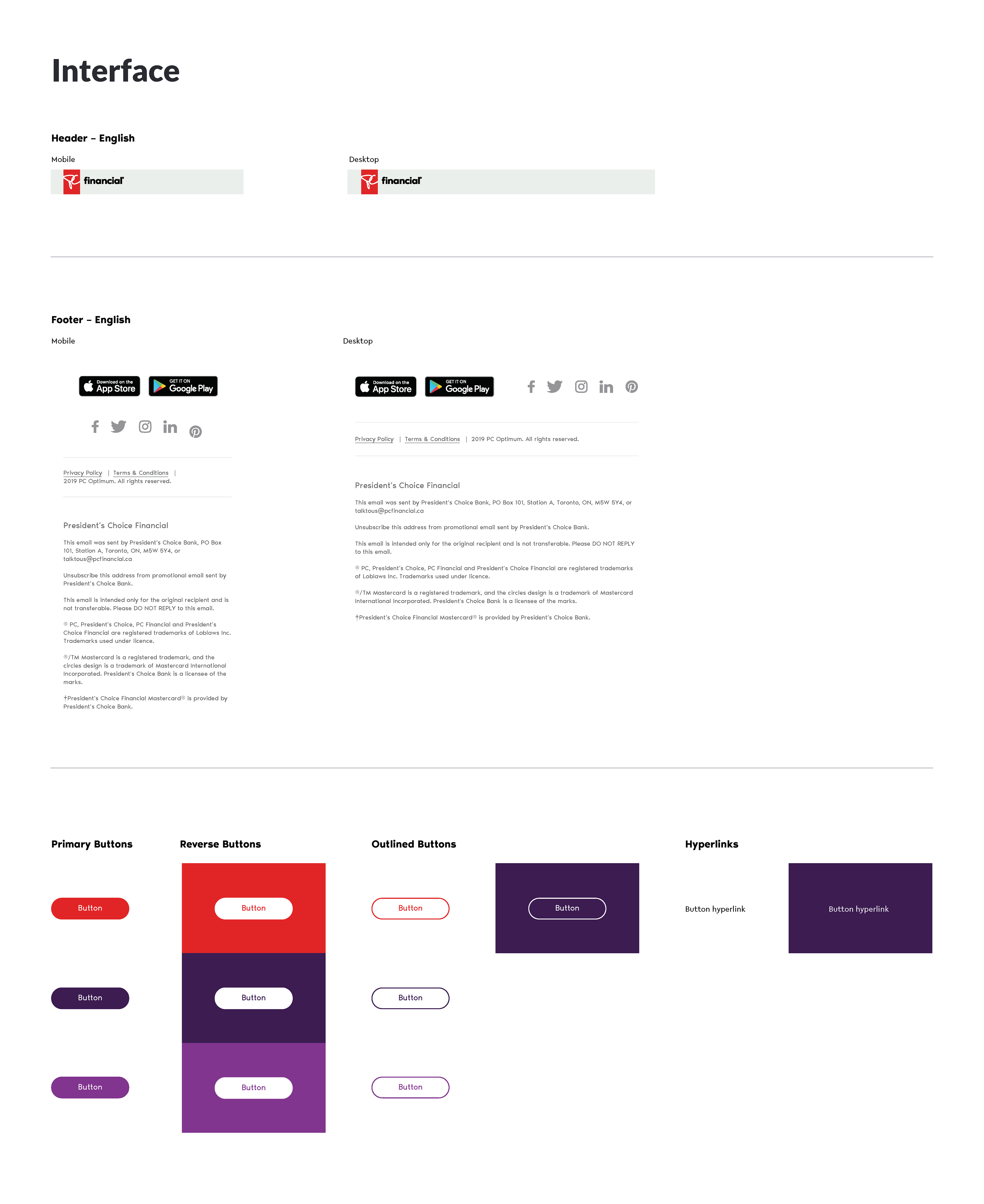
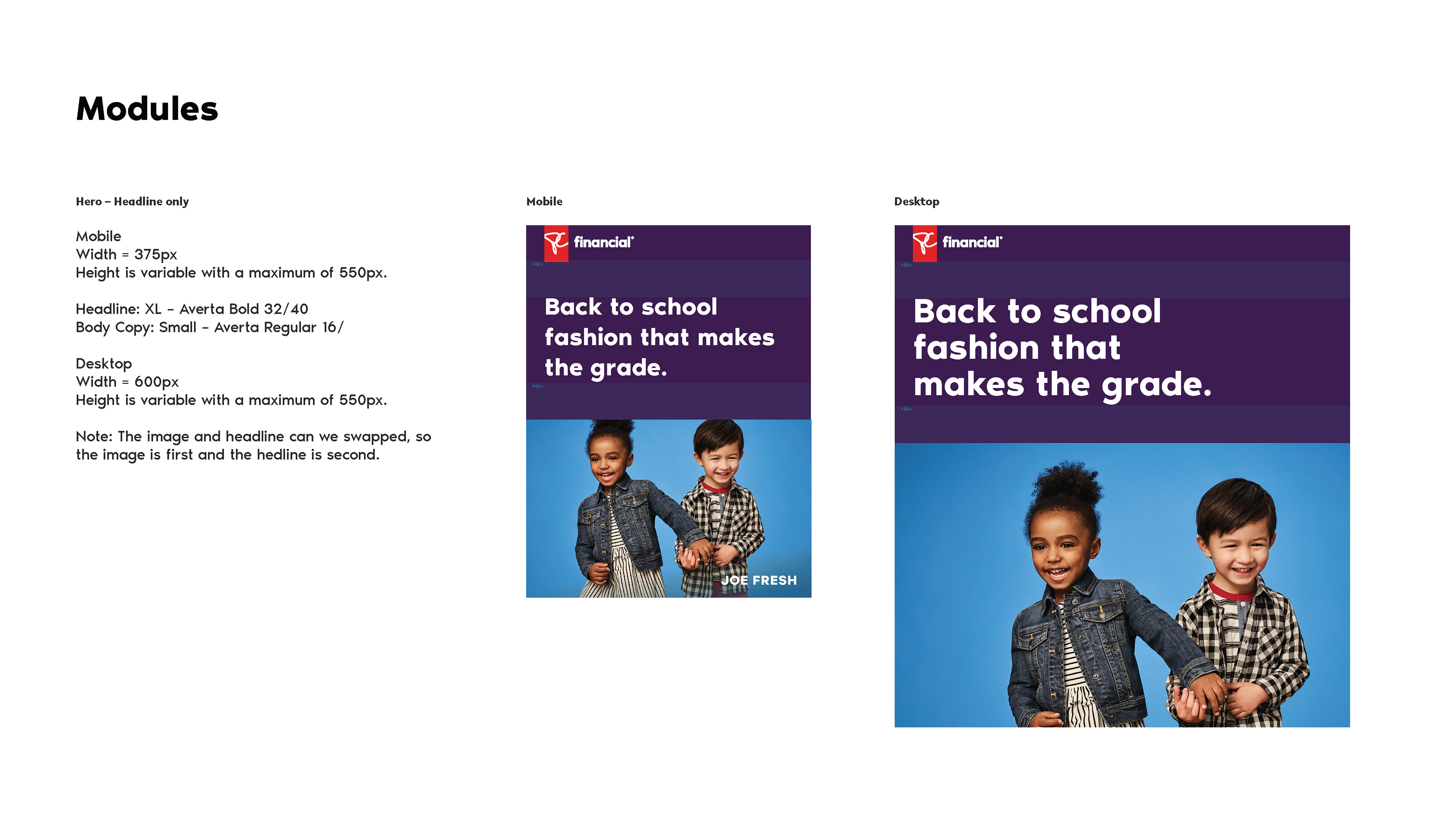
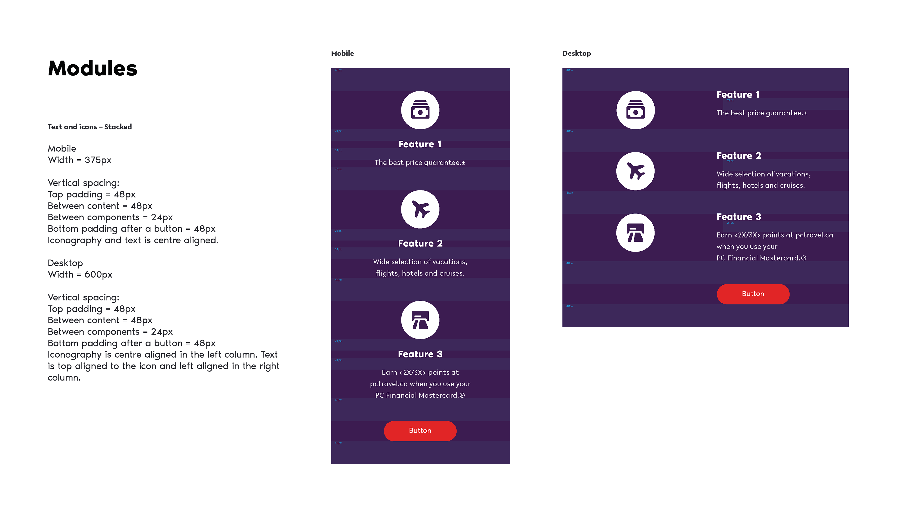
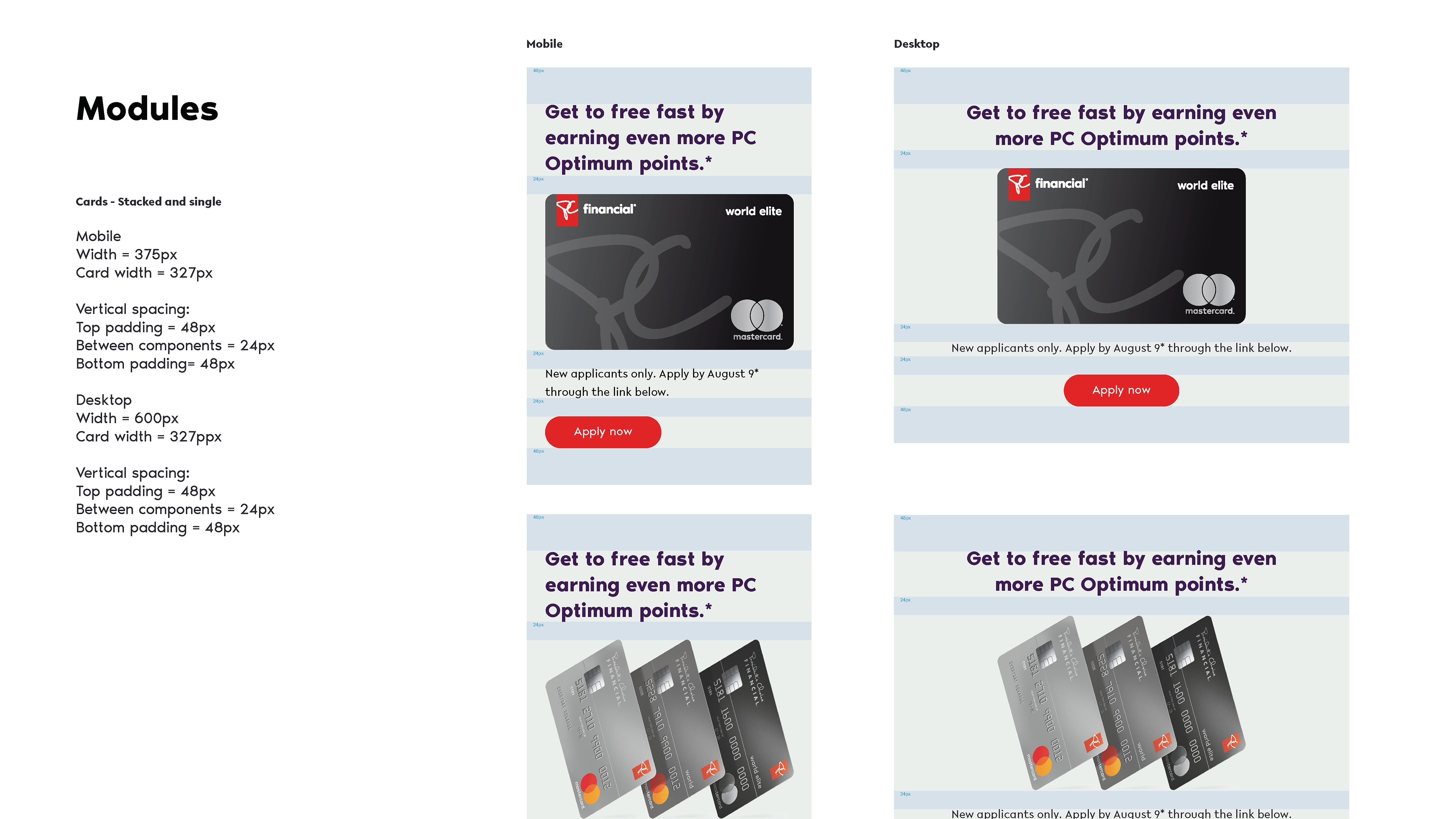
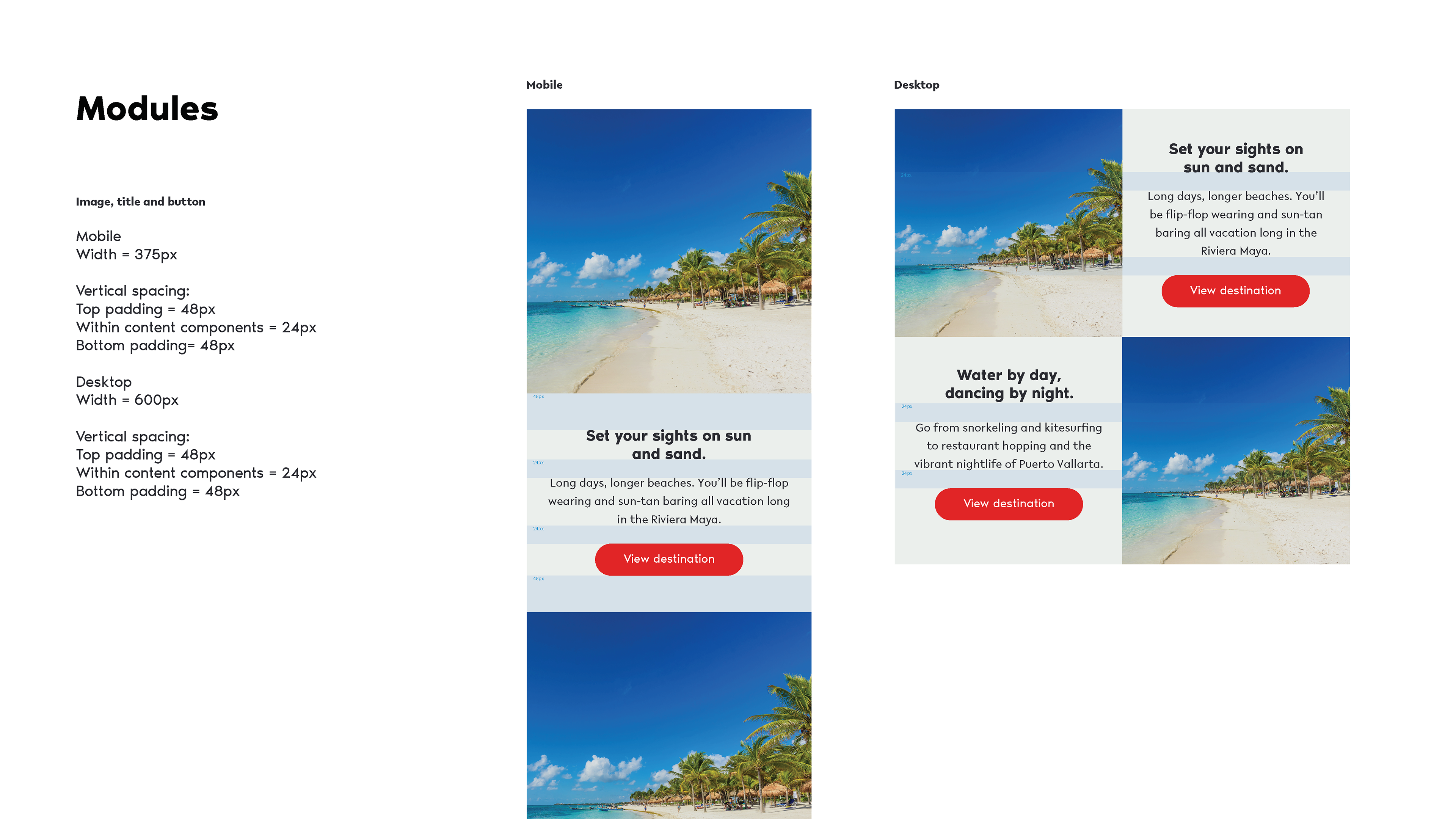
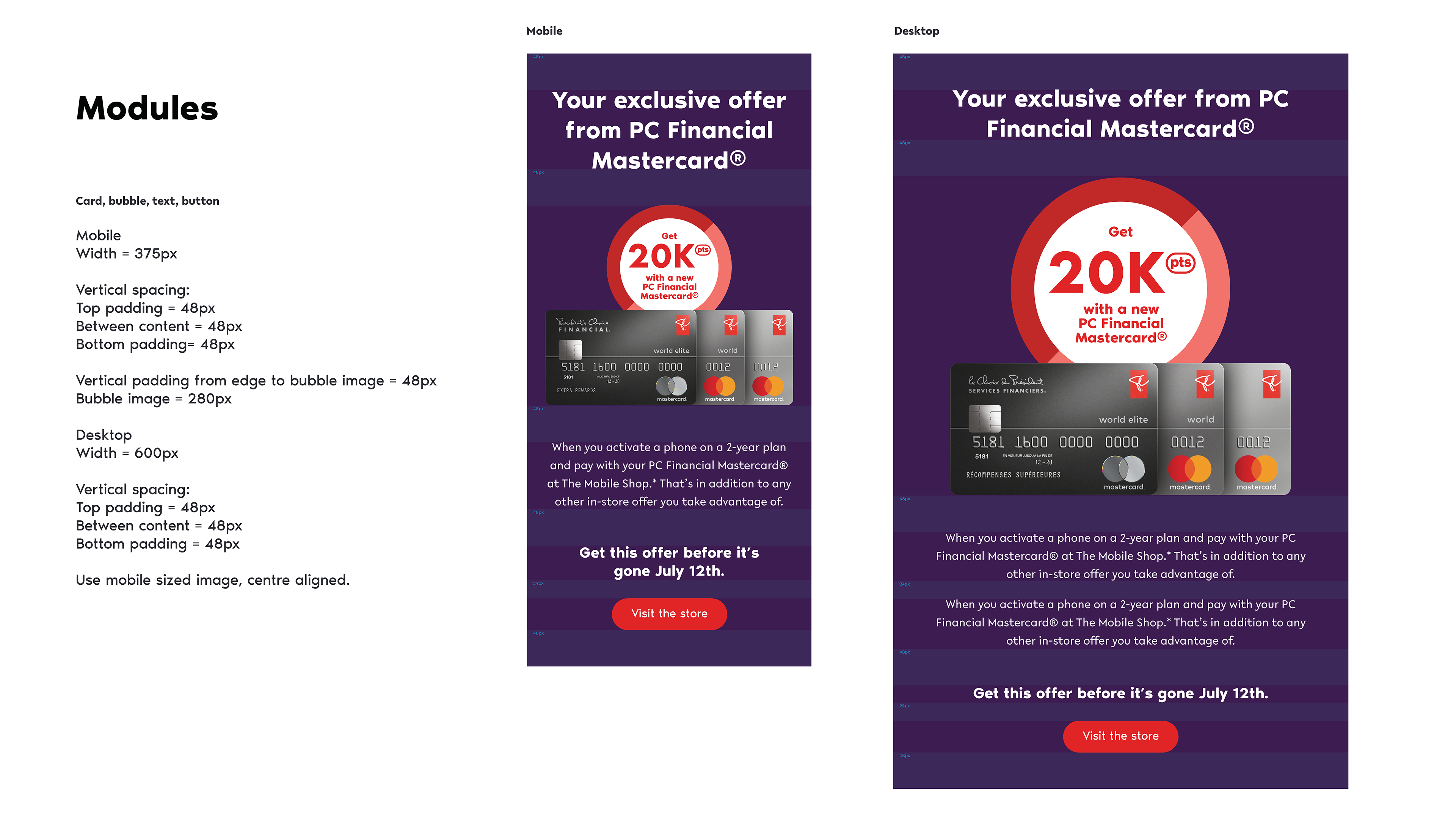
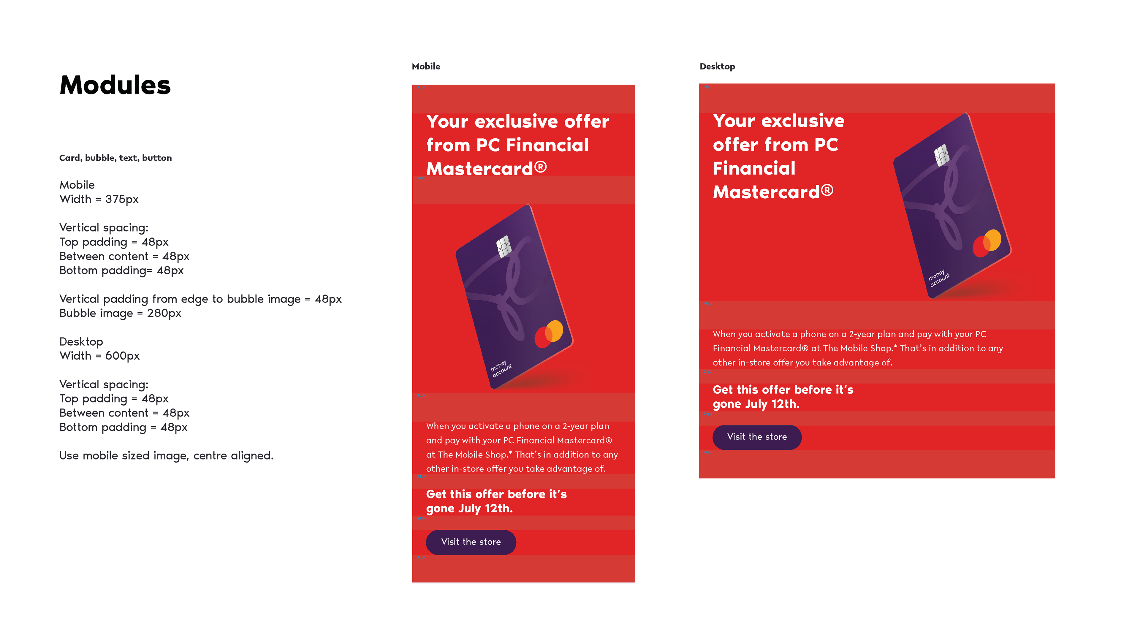
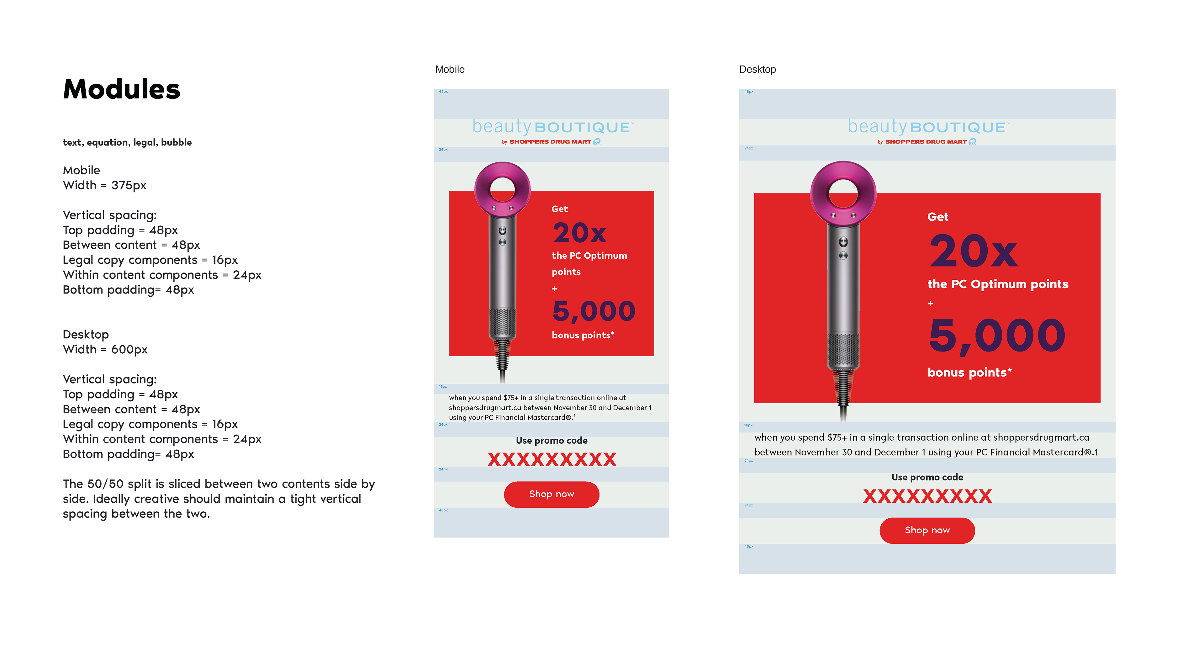
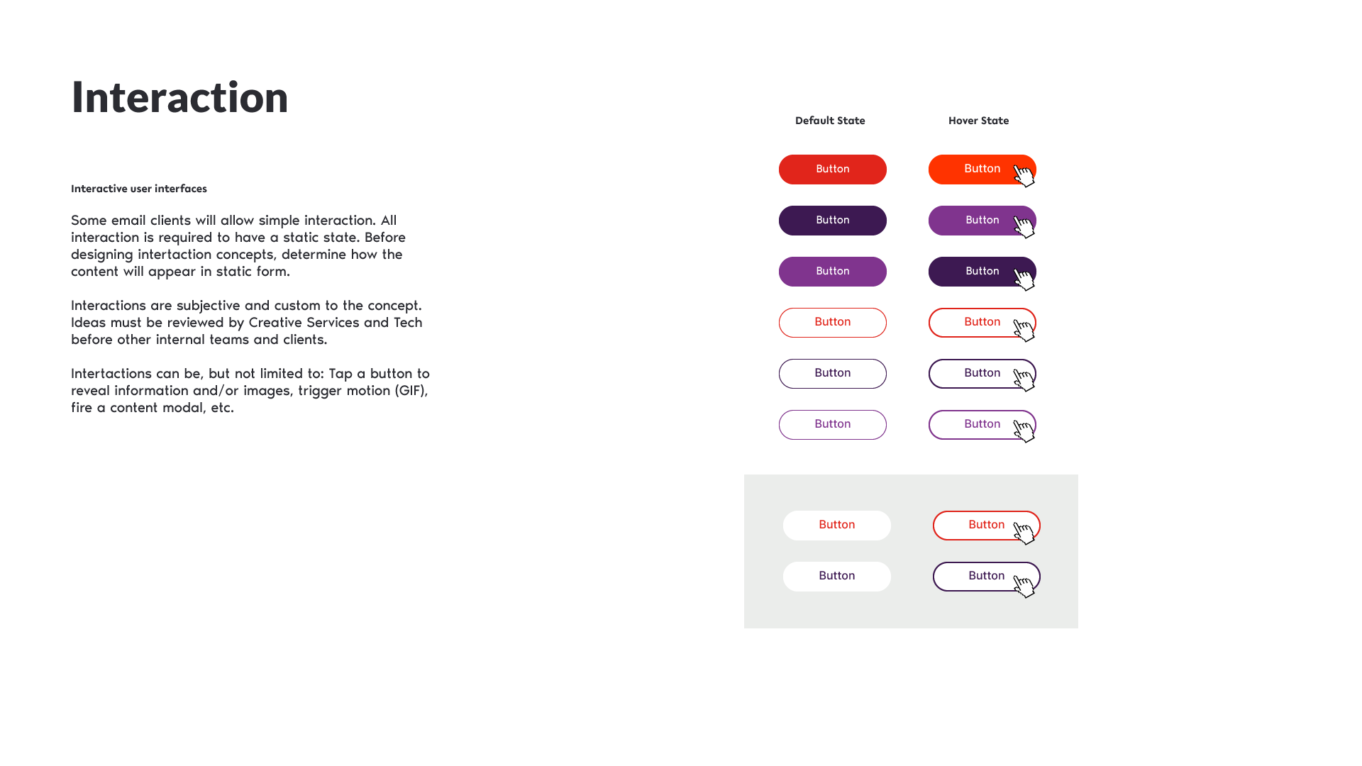
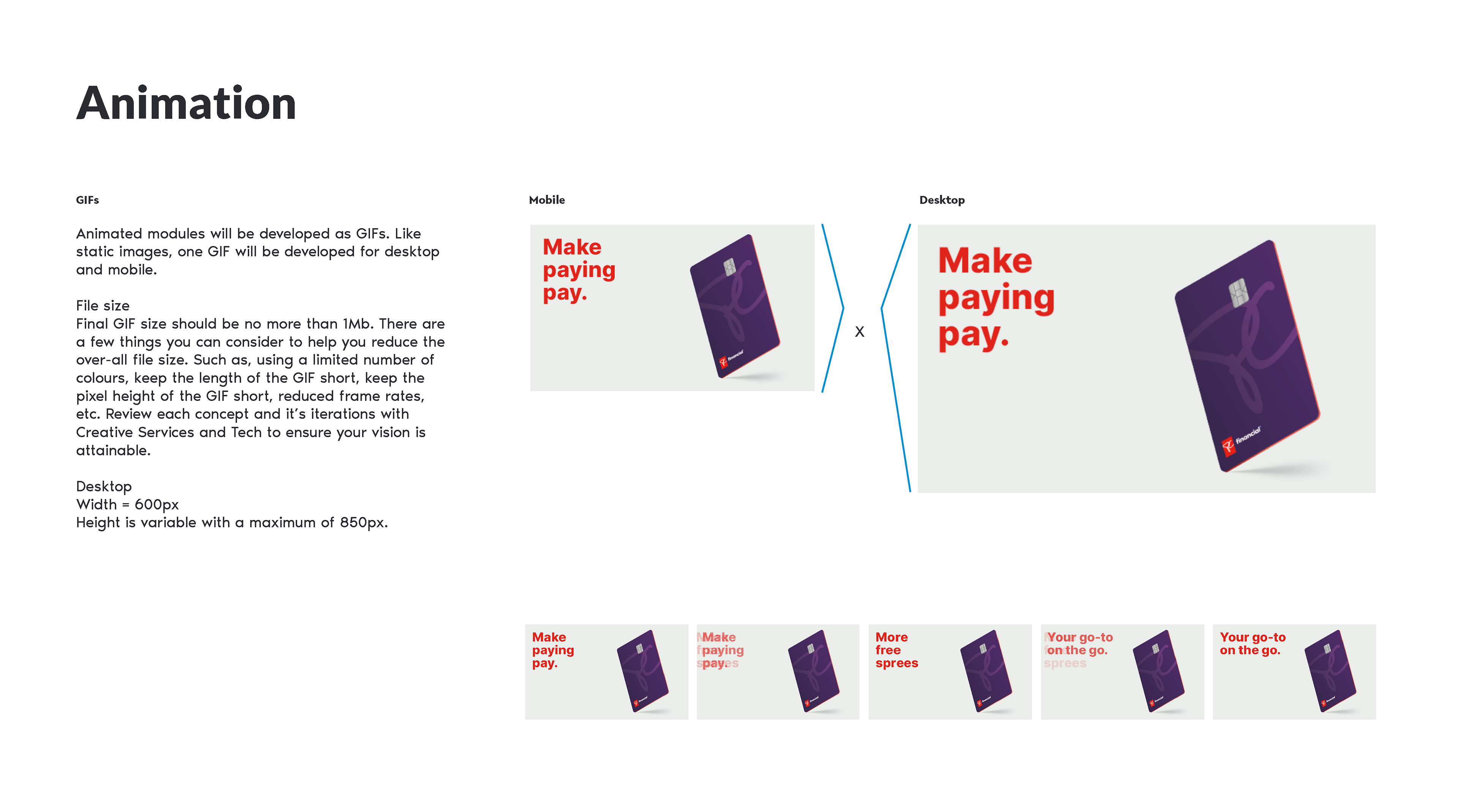
Live application to email for both mobile and desktop.
(to see more 'live applications' with other PC brands please click here to request)
(to see more 'live applications' with other PC brands please click here to request)

